Chicago Pedway
branding / environmental design / wayfinding
overview
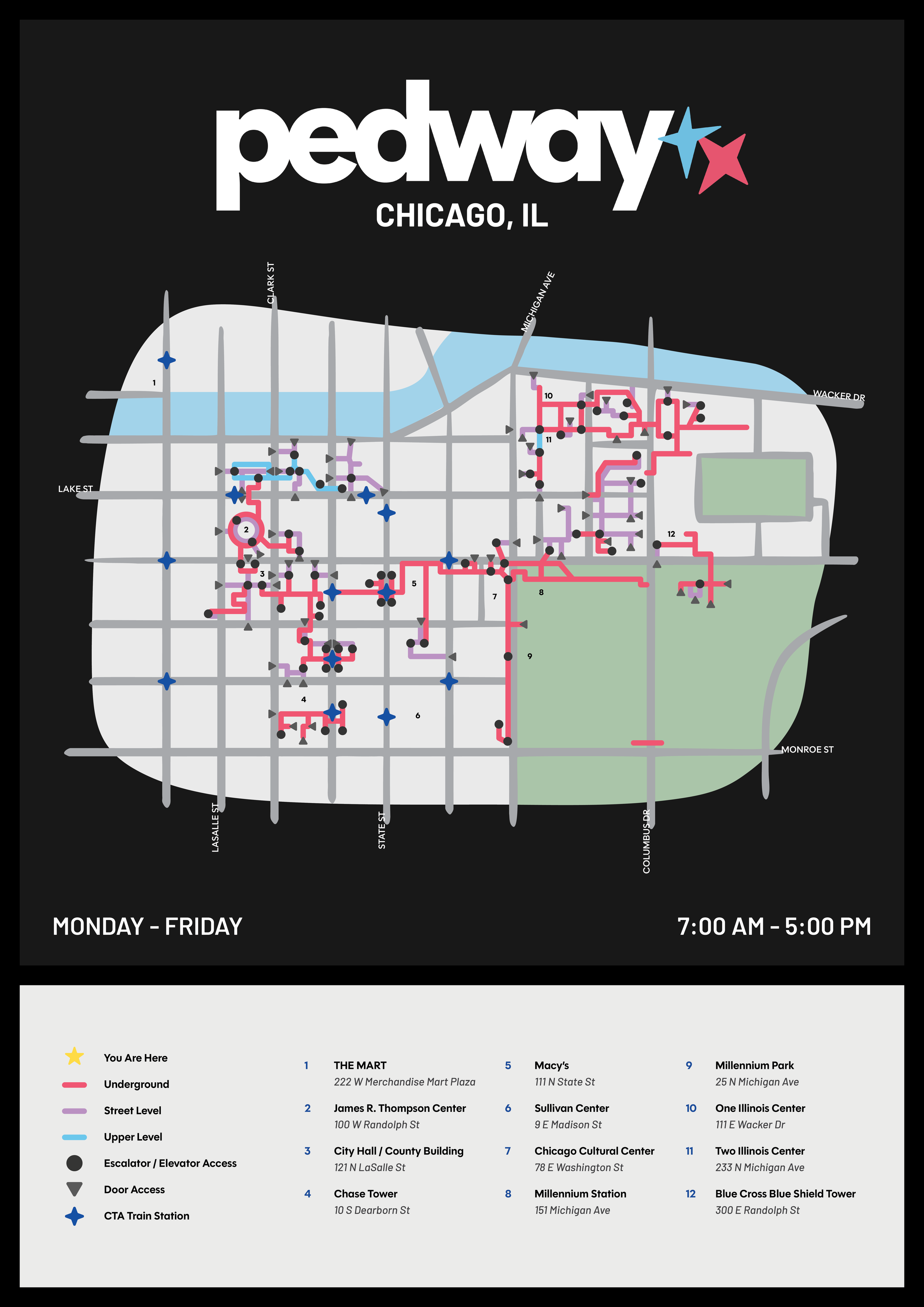
Running through the heart of the city, the Chicago Pedway is a system of underground tunnels, above-ground walkways, and overhead bridges linking more than 40 blocks over roughly five miles. The Pedway is one of Chicago’s best-kept secrets, hailed as a convenient way to travel downtown, as it allows pedestrians to avoid traffic and unsavory weather.
solution
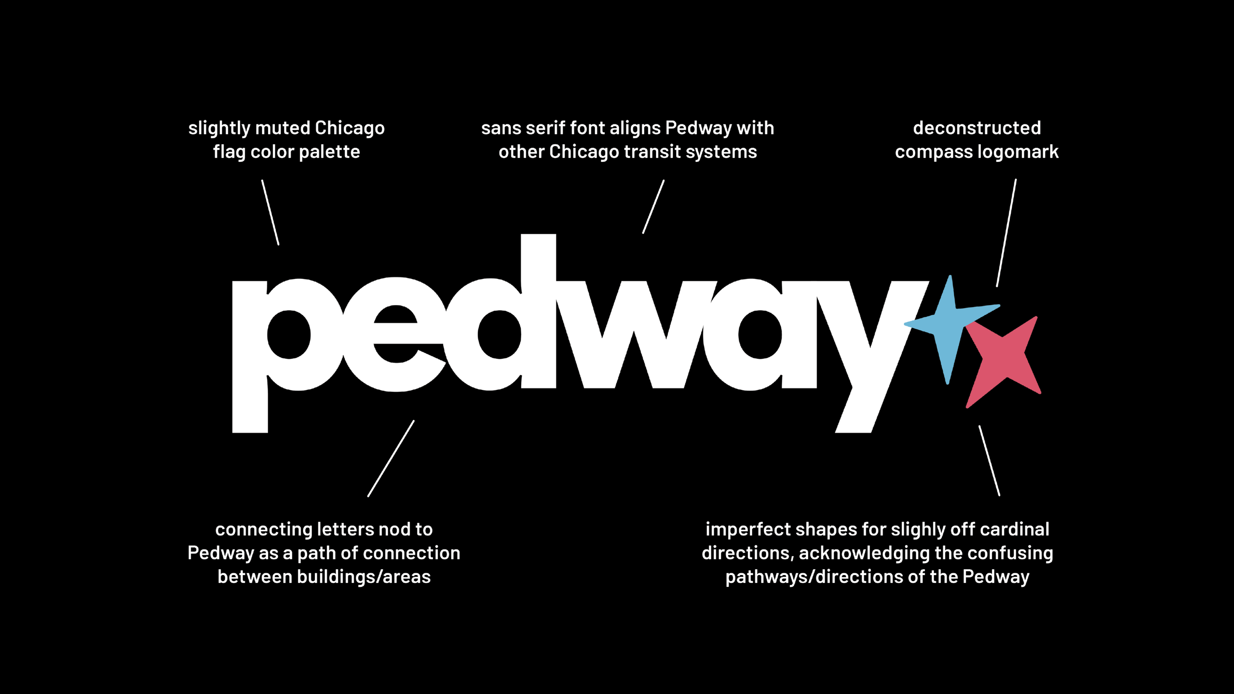
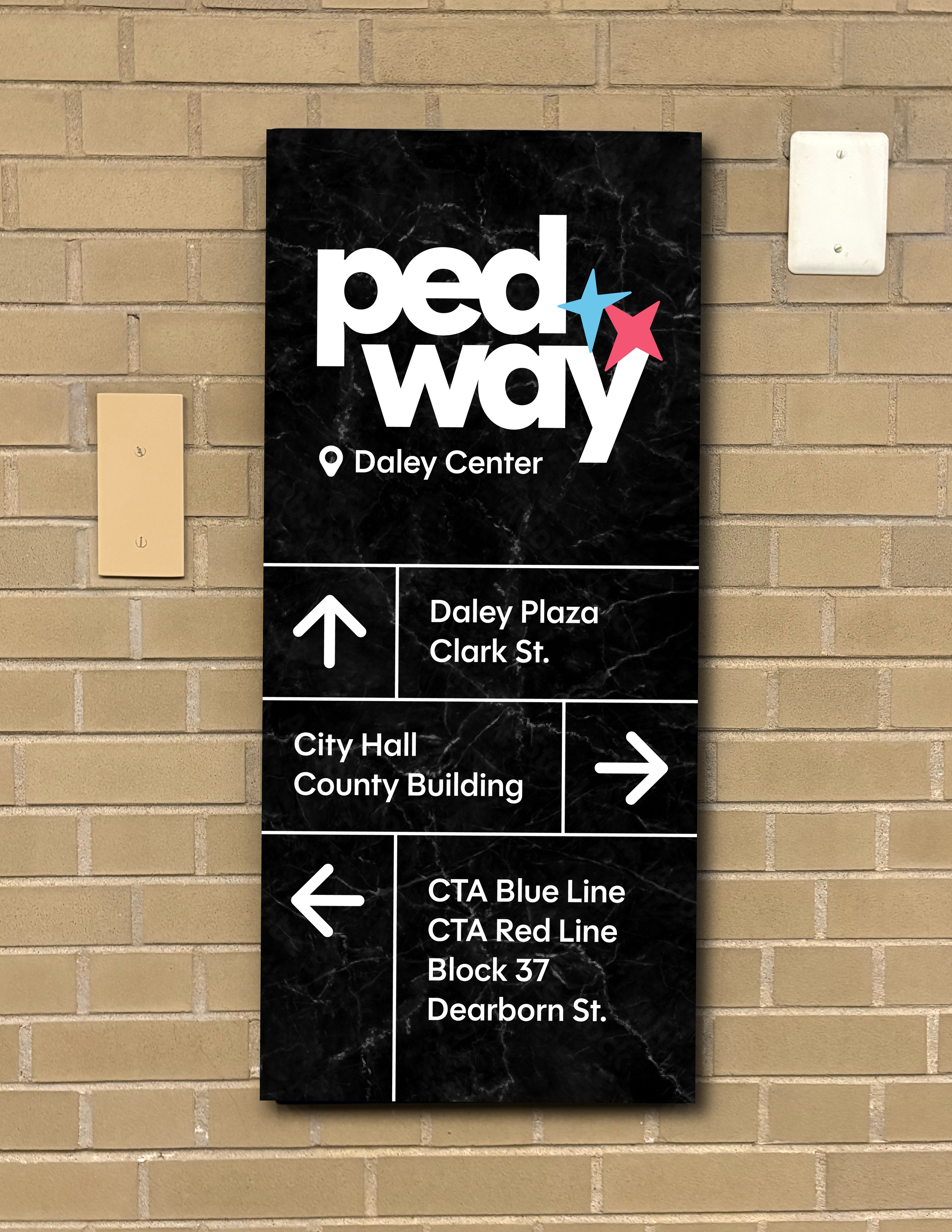
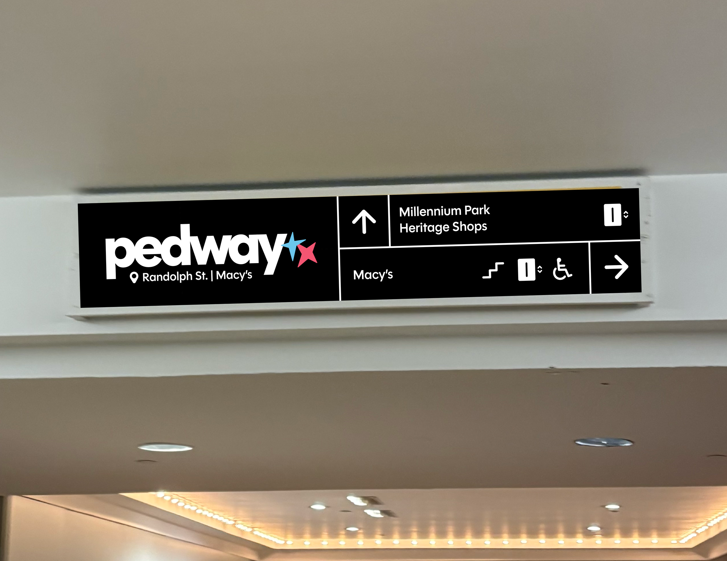
The outdated, confusing, and inconsistent branding and signage of the current system make it difficult to decipher what pathways actually qualify as the Pedway, giving the Pedway a reputation as a labyrinth of endless tunnels. The rebranded Pedway system features a cohesive identity that aligns with Chicago’s official design system, creating a more intuitive wayfinding experience that simplifies navigation and unifies the network.
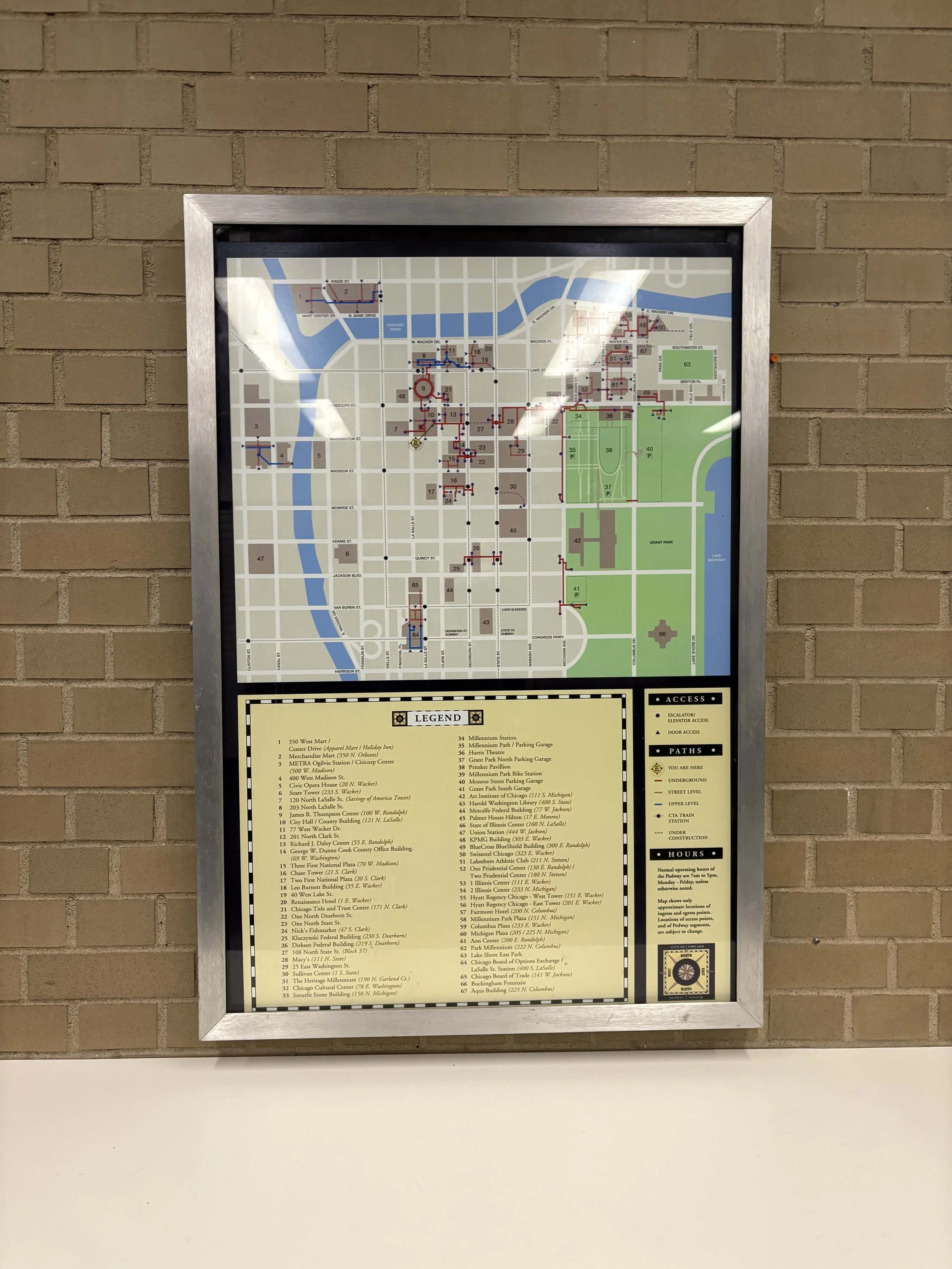
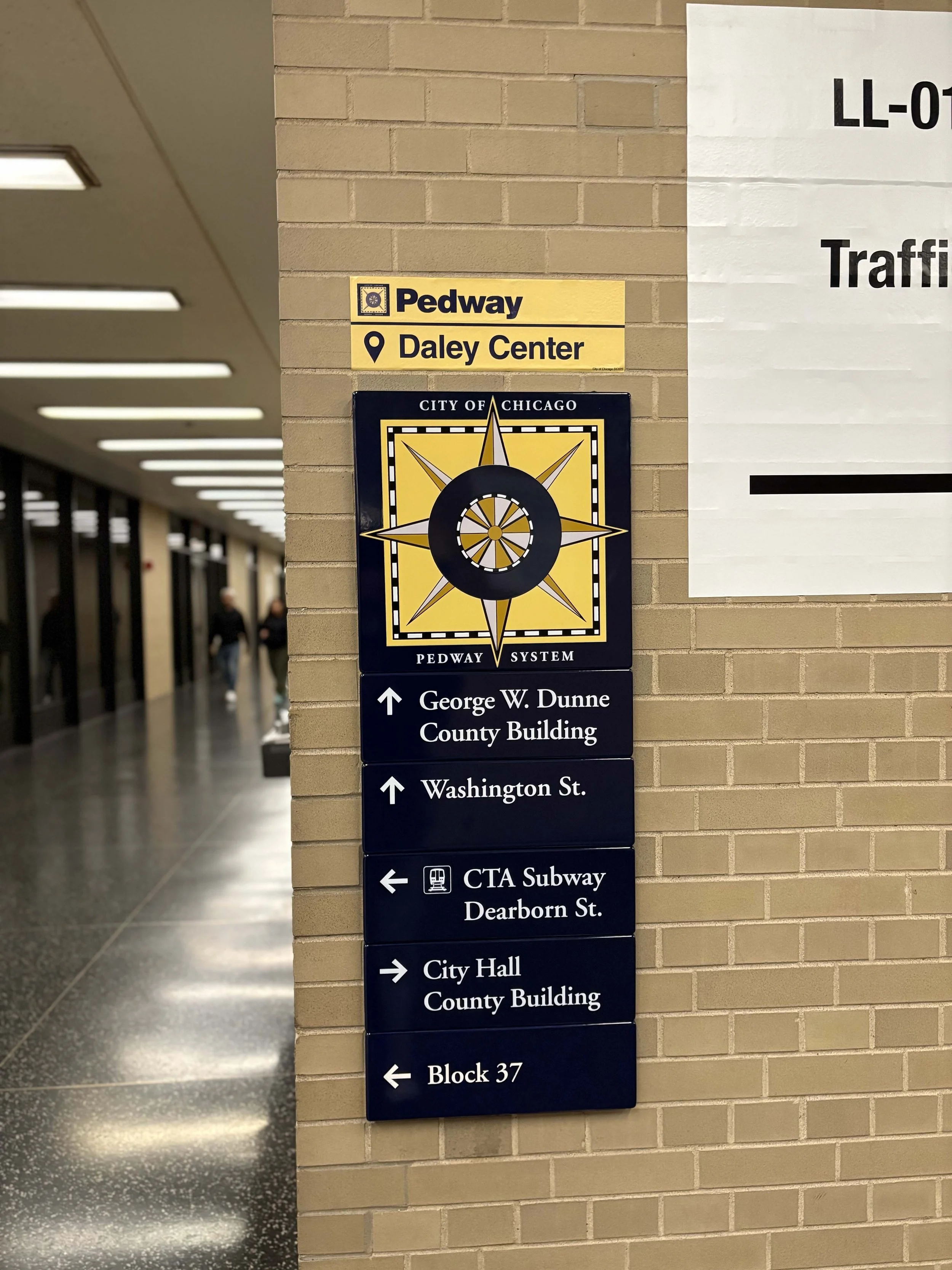
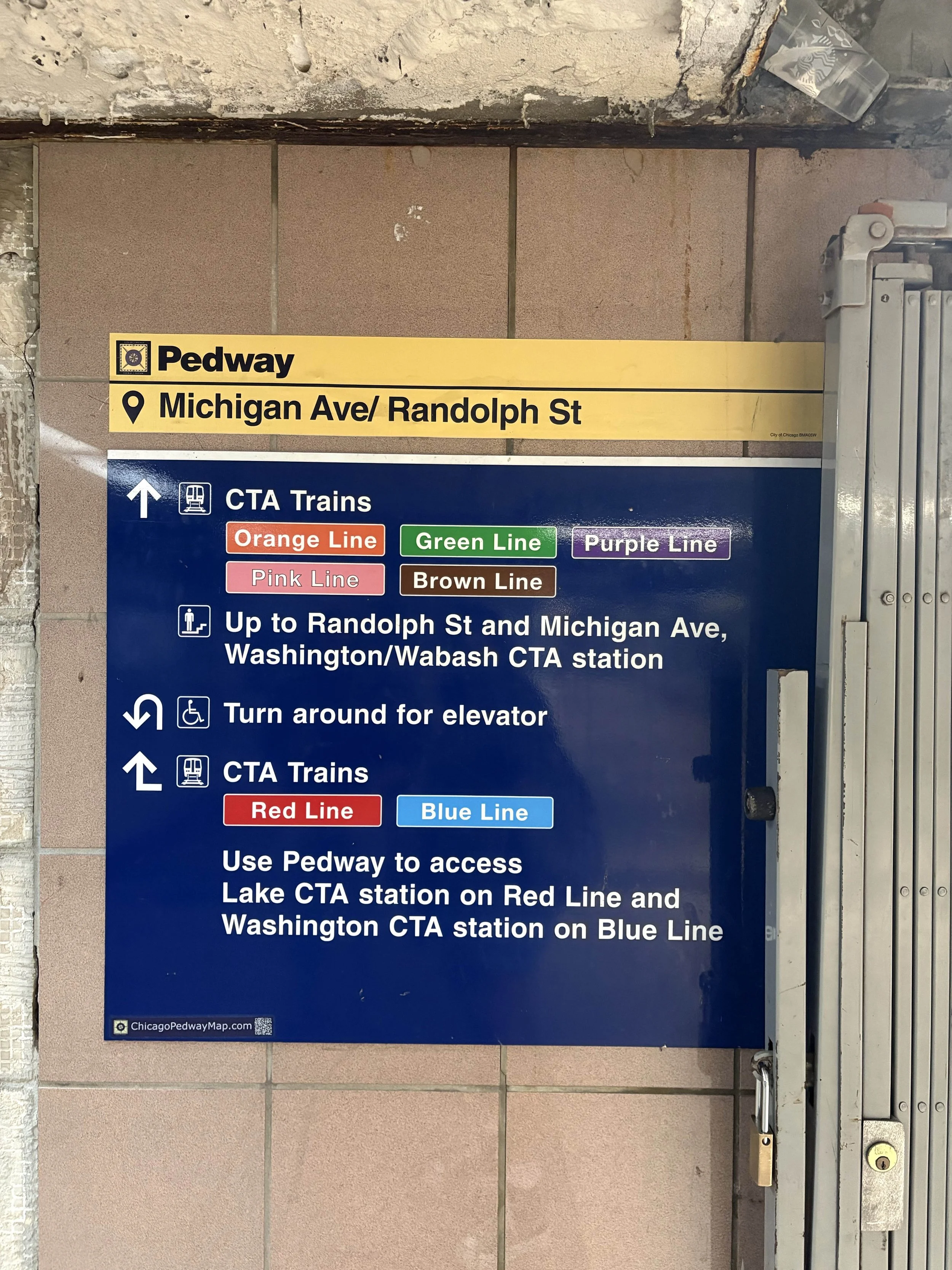
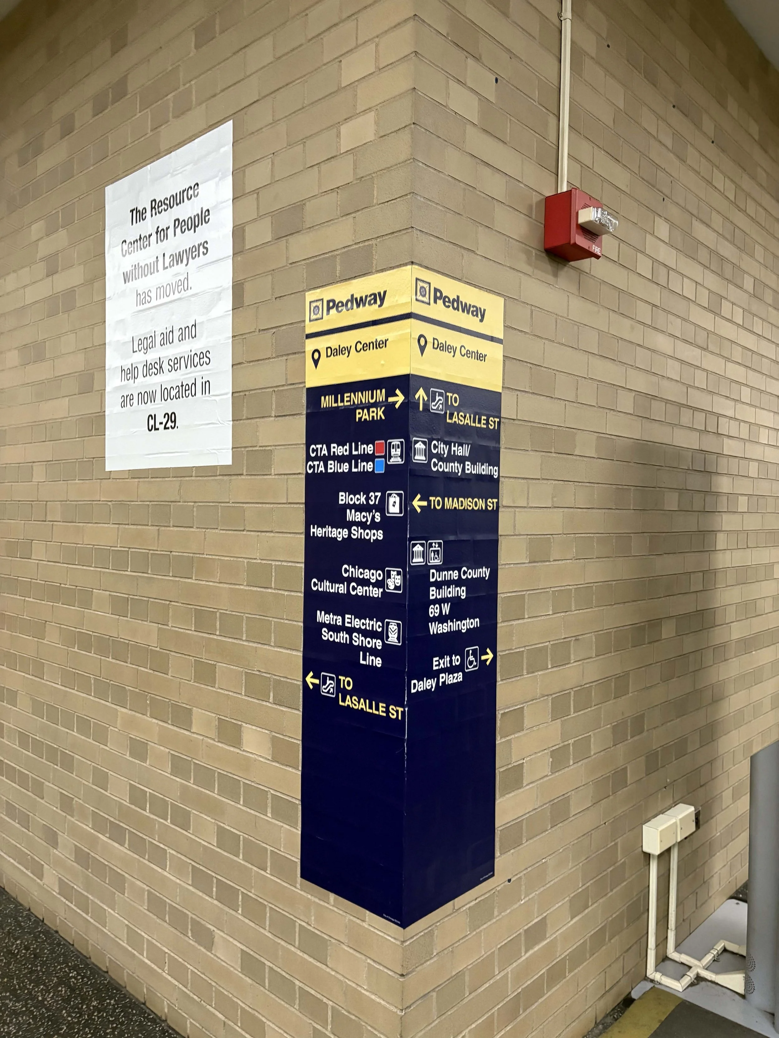
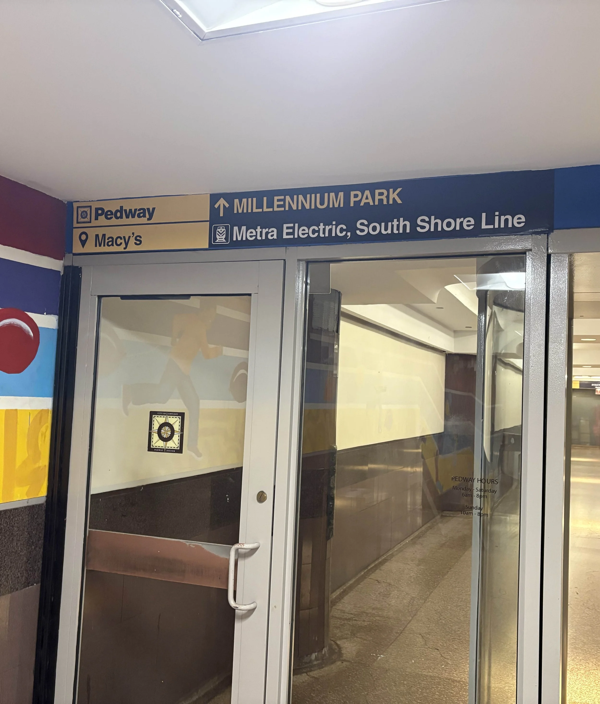
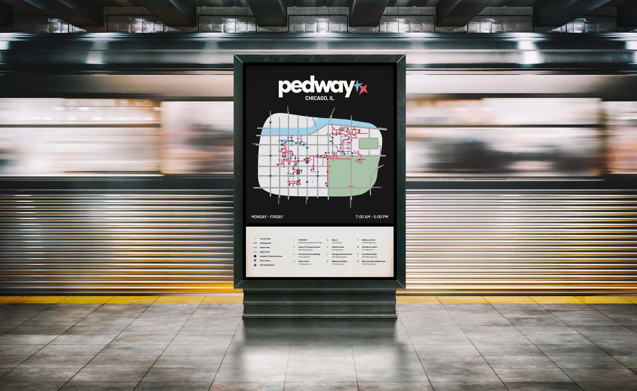
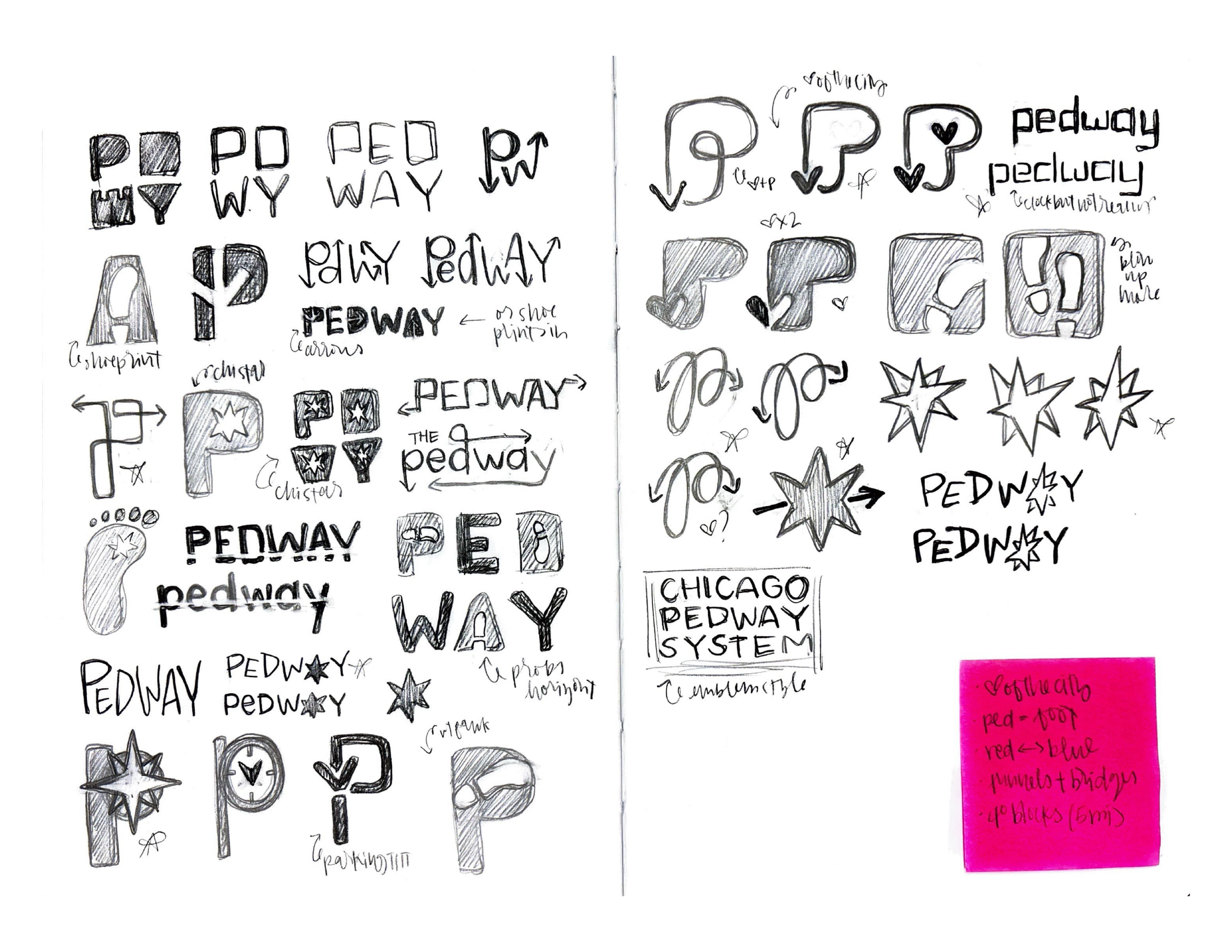
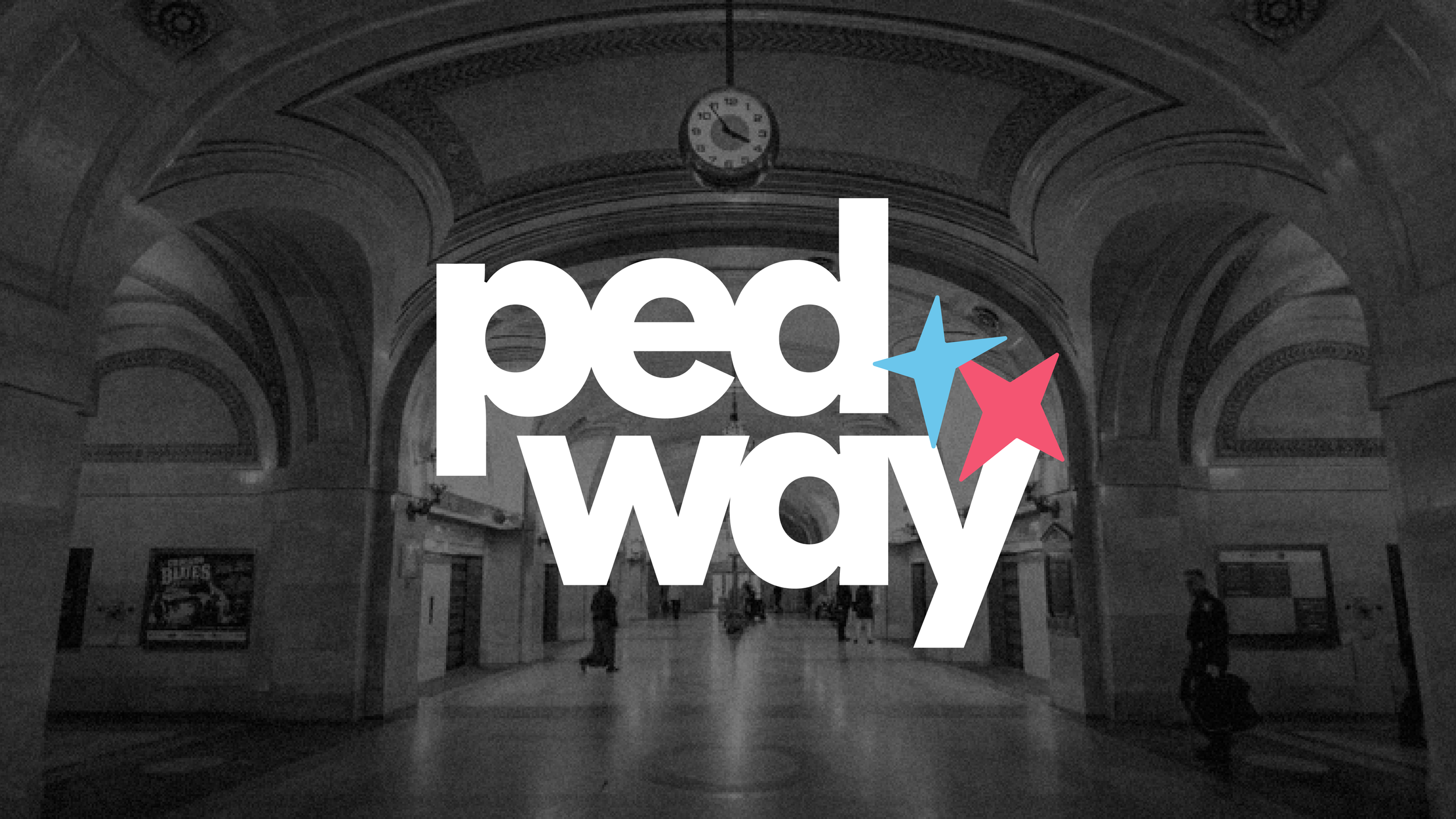
The rebranded Pedway sets a uniform system across all assets. The system takes inspiration from Chicago branding and landmarks, from the color palette, sans serif type, to the Cloudgate-inspired map shape. Signage is based on existing dimensions but redesigned to create a unified network across the Pedway system.